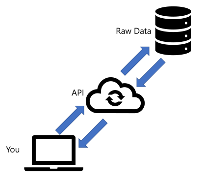
In my last article, I discussed the basics around REST APIs. We did not do anything with Power BI. While I did not get to the real purpose of this series, it was important to establish the basics. Using the elements we discussed, you can copy and paste them into Power BI to connect to your API.
For this post, I am using the Yahoo Finance API to demonstrate how this works. I do not receive any kick back for sharing this API. They have a free tier and it is a great API to use for beginners. If you want to try this on your own, you can follow along with this article.
RTFM – Read the Fine Manual
Before you do anything with APIs you must review the documentation. I worked with an API a few years ago that required a unique API key for each individual endpoint. If I had spent some time reviewing the documentation, I would have prevented hours of frustration as I tried to connect to various endpoints. If you are like me, you might find this frustrating. However, I find reading the documentation far less frustrating than constantly struggling to get an endpoint to work inside of Power BI.
Identifying Usable Endpoints
The first time I review documentation I am sorting out which endpoints are useable or not. I need to find out which API endpoints that will work with Power BI. I opened the documentation and was excited about what I saw…

At a quick glace, all of the endpoints are using the GET connection method. As a result that means every single endpoint can be used in Power BI. That is great to see!
Which Endpoint is for Me?
Knowing what you are looking for is key when reviewing documentation. I want to find stock price information and compare prices. Quality documentation will have one of two things to help you with this process:
- A data dictionary that clearly defines each column in the query
- A same response from the query

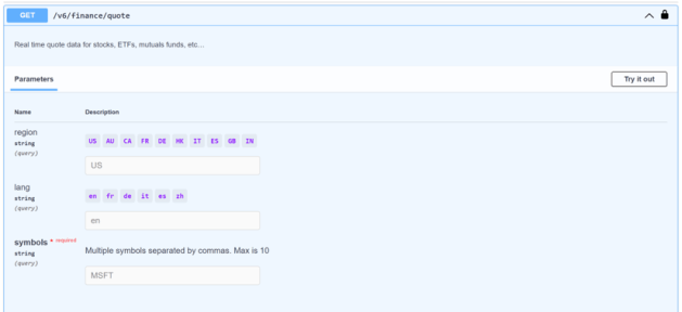
This documentation brings back a sample. As expected, I can find which endpoint meets my needs. As an example, I am interested in stock prices. According to the documentation, I can use the quote endpoint to accomplish my goal.
Setting the Parameters
Now that we have the connection method and endpoint, we need to establish what parameters are needed. Sometimes parameters are identified but not clearly documented. As a result, you might get frustrated because you cannot apply parameters to your query. This API is much easier to understand because of the clearly labeled parameters with sample inputs.

As you can see, the documentation provides sample values for each parameter so you know how to leverage it. This results in far less frustration because you know what values are accepted for each parameter.
Since this API has an option to try it out, I have updated the parameters to pull back Microsoft’s stock information. This allowed me to validate if my parameters were correct and saved me a ton of headaches. Since it worked, you can see that it came back with a response.

As a result of the test, there was another valuable bonus. The documentation assembled my connection string by putting the endpoint url and parameters together into a single connection string. How convenient!

Header Information
Up to this point the Yahoo Finance API documentation has explicitly called out each of the REST API elements. However, the headers in this endpoint are not as easily identified. We have to dig a little deeper to find them.
You probably missed the box above the connection string labeled Curl. Curl is a library used to call APIs if you are developing an application. While we are not developing an application, this box does help us identify our headers. If you notice, there are two lines with “-H” at the beginning. These are the header values we have been looking for!

Double Check
At this stage, we have identified all the elements we need for our connection in Power BI. We have the connection method, endpoint url, parameters, and headers. Remember that we are not using a POST connection method, so we do not need a body for this request. Now we just need to plug it into Power BI!
Connecting to our REST API (Finally!)
With all of our elements in hand, we can open up Power BI and start building our connection to the API.
Step 1 – Select the Web Connector
Open Power BI, select “Get Data”, and choose the Web connector:

Step 2 – Copy/Paste Elements into Power BI
First things first – switch to the advanced mode for the Web Connector so you can add all of the required details.

You will notice that there is no option to select your connection method in this view. Power BI defaults this to GET, so you do not need to configure anything. One less thing to worry about!
Go back to the documentation and copy your connection string. If your documentation does not assemble this for you, you might need to do this by hand. Once assembled, paste it into the URL Parts box in the web connector.

Next, we can add the headers. This endpoint has two – Accept and X-API-KEY. You will only see one set of boxes at the bottom. You can simply click “Add header” to accommodate for the second header.
For the Accept header, we can select it from the drop down on the left as it is a commonly used header. On the right, copy and paste the value found in the API documentation.
For the X-API-KEY header, you can enter your own value in the drop down or copy/paste it from your documentation. You can copy your API key from the documentation as well into the box on the right.

By bridging the documentation with the web connector, we have successfully filled in all of the blanks for the connection method, endpoint url, parameters, and headers. With everything in place, we can click okay and connect!
Step 3 – Authentication
Since this is the first time we are using this connection, we are prompted to select an authentication method. If you are using the Yahoo Finance API, you can easily select Anonymous and click connect as our API key handles our authentication.

On the left, you can see there are other authentication methods. Sometimes your connection method will require a username and password. I have experienced this with ServiceNow and Honeywell APIs. If you are adventurous and want to try using the Microsoft Graph API, you will need to use your organizational account. You will need to review your documentation to determine if you need to use other forms of authentication to use an endpoint.
Transformation Time
By following these steps, you should now see your stock data inside of Power Query. All of the information you saw in the sample response should be in a tabular format and ready to go. For an easier view, I made some adjustments so you could easily compare the values:

With this query in place, you can quickly refresh the data and will always have up to date stock quote information for Microsoft.
Next Steps
With everything connected, you probably think we are finished. If there was only one stock we cared about, we would be in good shape. However, investors are looking at several different stocks each and every day and this query only pulled one. In my next article, I will show you how to scale this query so whether you have 10 or 1,000, you will have a maintenance free report that always refreshes.
Until then, did you follow along with the Yahoo Finance API? Were you able to get some valid data? Tell me in the comments below!